Revamping a Loyalty Program
How Rue Gilt Groupe increased customer lifetime value by enhancing their loyalty programs

Summary
Rue La La and Gilt are online discount retailers offering name-brands up to 70% off. For years, they have offered members an annual paid subscription for free shipping.
Because of a decline in business, Rue Gilt Groupe saw an opportunity to lean into their most loyal customers by revamping their shipping program into a loyalty program–providing members with more value beyond free shipping and rewarding them for their loyalty.
We believed that by introducing tiers, rewards, and more perks, we would motivate members to spend more and ultimately increase LTV.
Company
Rue Gilt Groupe
Year
2024
Role
UX/UI
Strategy
Research
The Problem
After launching the MVP of our revamped loyalty program, we weren’t seeing the lift in business that we had projected. After surveying members, we discovered that only 11% of loyalty members were aware of changes made to the program–specifically tiers and rewards.

Discoverability
How might we increase visibility of the program for active and prospective loyalty members?
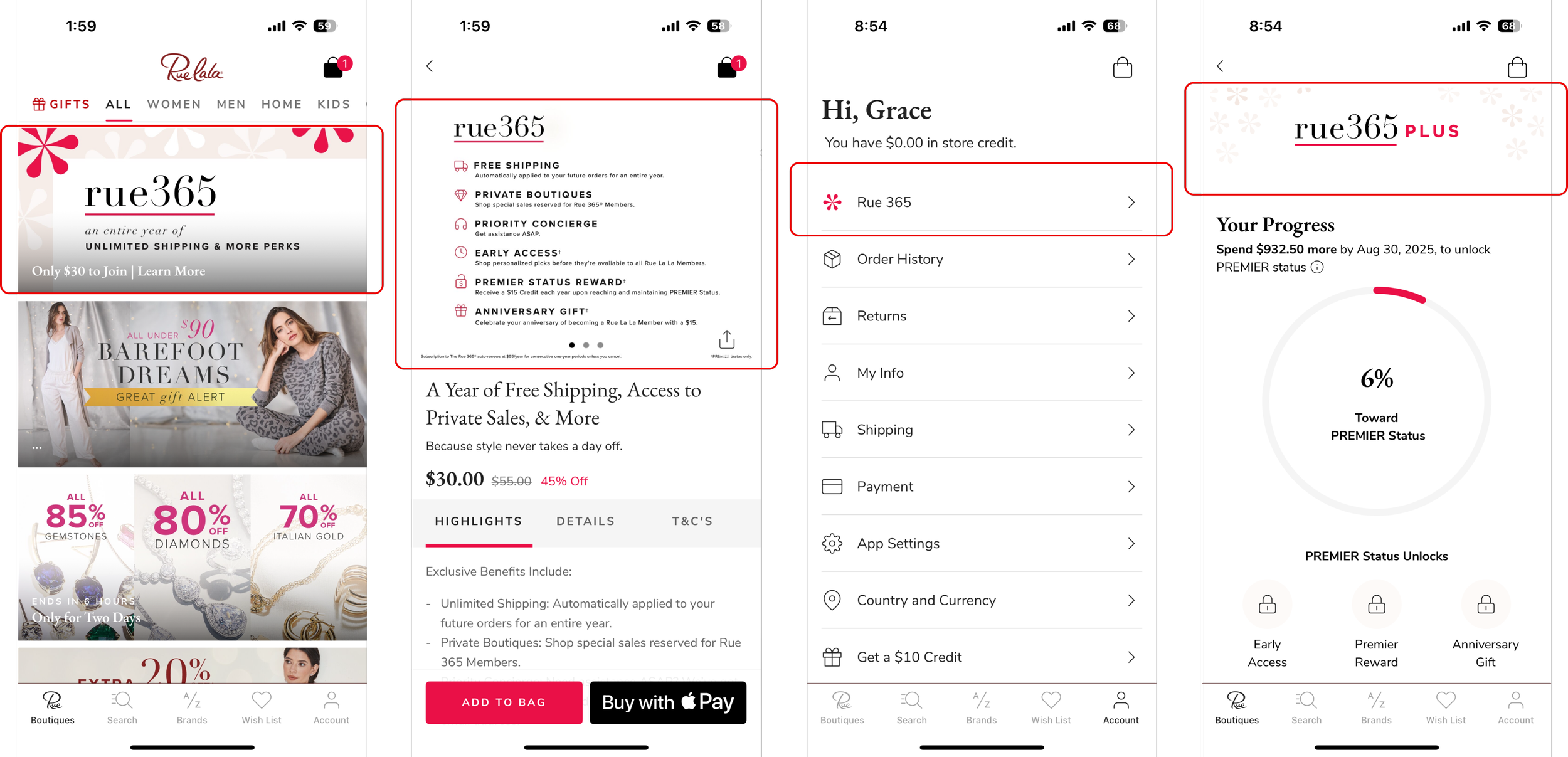
Program Page entry point has no context. Program is not mentioned in cart. Difficult to find private and early access sales.
Messaging
How might we improve our messaging to lead with motivating, dynamic, contextual copy?
Marketing assets do not highlight the free shipping value prop. Updates to a loyalty program are not relevant to new members. All messaging is static and does not reference tier, progress or rewards.
Emotional Connection
How might we evoke emotional connection in the UI and make our best customers feel valued?
There’s a disconnect between the branding of our marketing assets vs the UX/UI.
The Approach
Loyalty 2.0 was a multi year project that a lot of market and user research went into (back when we had a research budget). The project was handed to me after the original designer’s position was eliminited. When I received the designs, they were high level concepts and my role was to execute the vision.
Because the work had already been approved, scoped and prioritized, my hands were pretty tied. Being myself, I went through the entire experience with a fine tooth comb, asking questions, digging through research and insights, and proposing subtle improvements wherever I could get away with it.
Research
A few months after Loyalty 2.0 was launched, the business started to notice some negative trends and I was tapped to iterate on the UX. Because the changes to the program were not isolated or tested, it was tricky to understand what was and wasn’t working. Our marketing partners sent out a survey to existing members while I performed extensive competitive research.

From beauty, to fashion, to food delivery, I researched loyalty programs in every industry–noting common themes and patterns.
Collaboration
Once a week, I hold a 1 hour meeting called Design Room. In attendance are my PM, Tech Lead and any cross function contributors, so in this case–a representative from Marketing and Creative. The goal of Design Room is to keep projects moving, gather feedback, share insights, get aligned and create camaraderie–all lead by the Designer. I’ve learned that if you don’t bring folks along for the ride, you’re never gonna get there.
To begin, we reviewed the survey insights and competitive research together and aligned on the core problem to solve. From there, we defined key areas of opportunity and aligned on where in the experience to hone in–considering LOE, business impact, user impact and if the feature should be A/B tested or not.
Once the working team was aligned on which concepts we wanted to pursue, I presented them to our stakeholders: SVP of Product and SVP of Marketing. I gathered their feedback, iterated on the designs–rinse and repeat. Once we got approval from our stakeholders, I ultimately presented to and got buy in from the CMO.
The Concepts
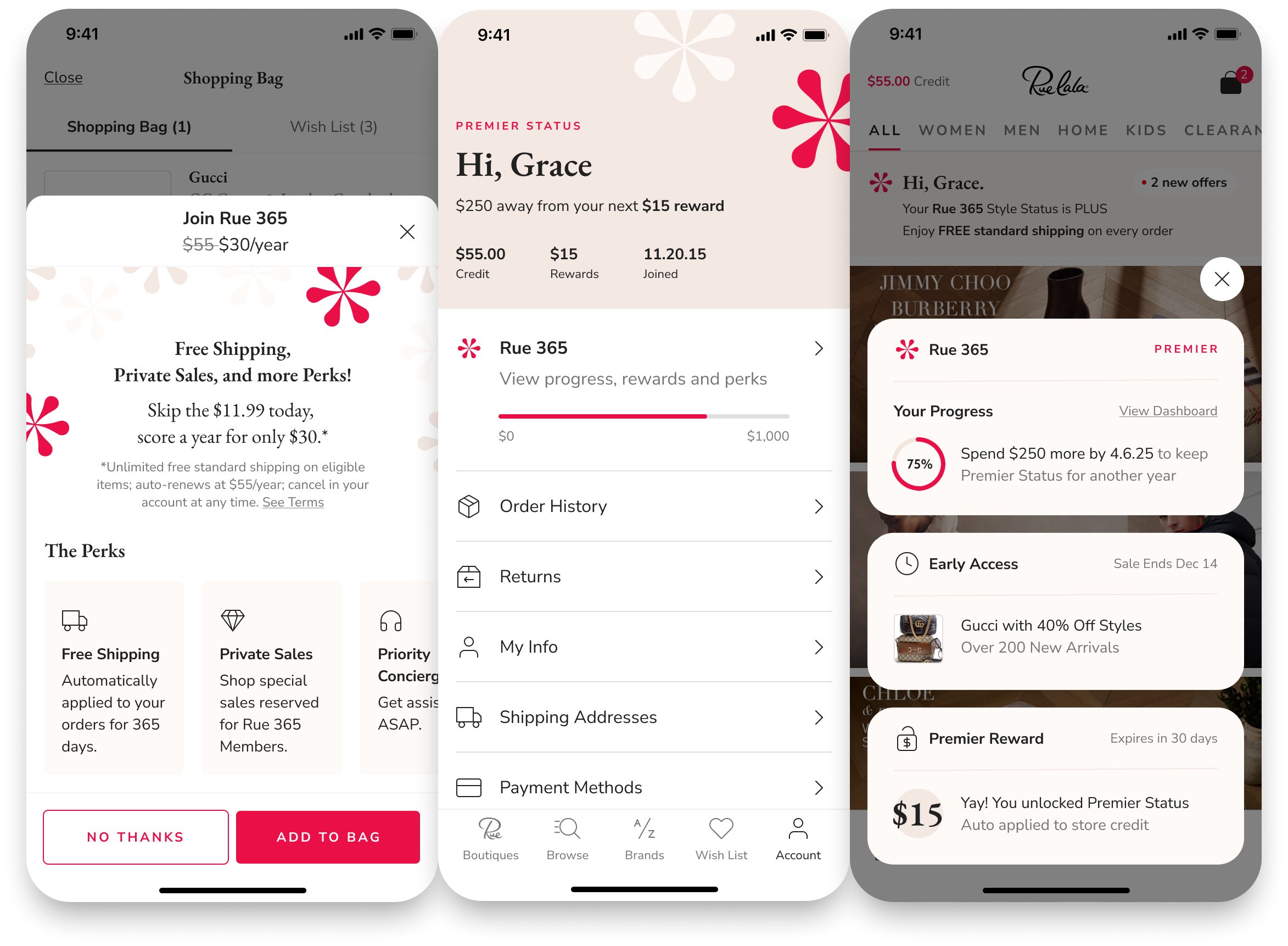
I explored what felt like a million different concepts across the entire customer journey–for both prospective and active loyalty members-for both Gilt and Rue La La. I focused my thinking around the key areas of opportunity we defined–increase visibility, improve messaging, and evoke emotional connection. The challenge was a delicate balance of increasing program visibility without distracting from the core job to be done on each page.

Account
Drive program awareness and motivate members to spend by highlighting tier/rewards/progress.
Evoke emotional connection by personalizing and branding the UI.
Drive program awareness by adding context to the Program Page entry point.

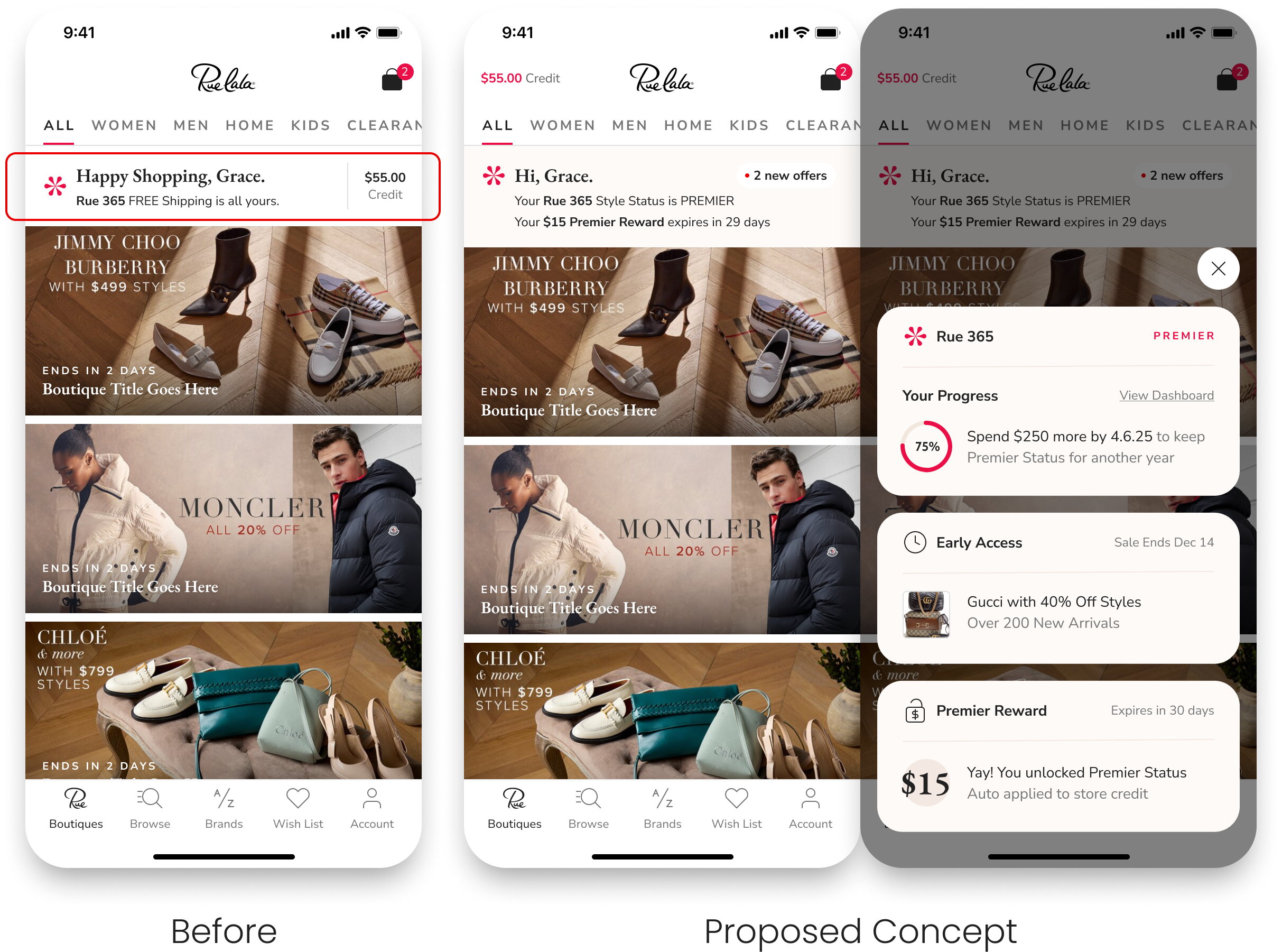
Notification Center
Drive program awareness and motivate members to spend by highlighting tier and rewards.
Improve messaging by making the value prop dynamic: FREE shipping OR expiring reward OR $250 or less away from a reward.
Encourage members to keep checking the app by highlighting new offers.

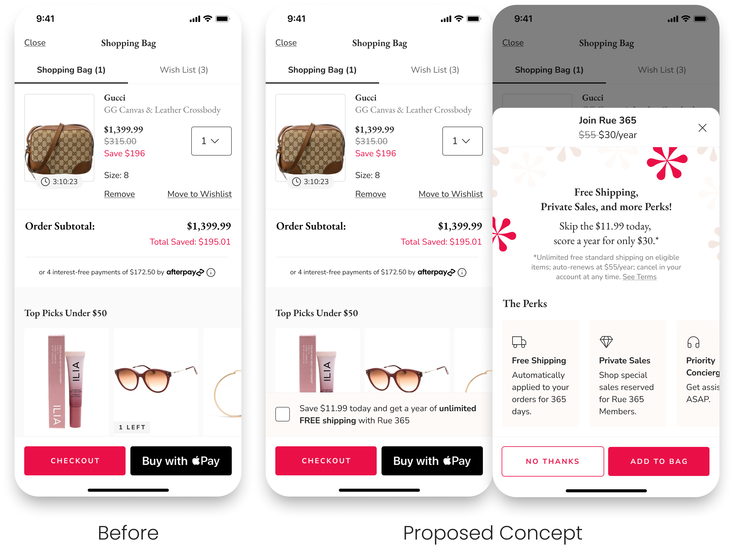
Cart Upsell
Drive program awareness and motivate members to checkout by highlighting free shipping and reward.
Upsell Rue 365 by highlighting program benefits and savings in a sticky banner above the CTA.
Highlight perks and savings and let members add program directly to cart, without leaving cart.
The Outcome
I partnered with my PM, Tech Lead and Marketing to define a roadmap of loyalty optimizations for 2025. Stay tuned for the results!